The health data we decided not to store
The client asked to save patients' answers on the server. I said no, explained why, and then built the comparison they actually wanted, without a single answer leaving the browser it was typed in.
- Role
- Designed and built end to end, alone: design, development, and product advice on practices and regulation. The product vision was the client's.
- Client
- Alnylam, on TTRacker (ttracker.com.br), a clinical monitoring platform for ATTR amyloidosis
- Period
- About a month, in 2026
- Context
- A rare disease, health data, and a stack I did not choose: the client's WordPress and the plugins they already had
- What I personally did
- requirements with the client, the seventeen instruments, the calculators, the comparison, the print layout, the accessibility, the tests, and the working flow I built to do all of it
The request
The client wanted to store patients' answers so a doctor could compare one consultation against the next. The need was real and the value was obvious. Storing the answers was the wrong way to get there.
Why I said no
Three things stacked up. Health data, on a WordPress platform with the plugins the client already owned, under a law anyone designing digital products has to watch. My law background keeps me watching regulation, so I raised the question before anyone asked me to. I did not give legal advice. I put the risk on the table early, and their own legal team reached the same conclusion later.
What I built instead
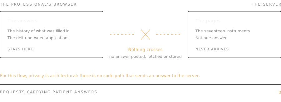
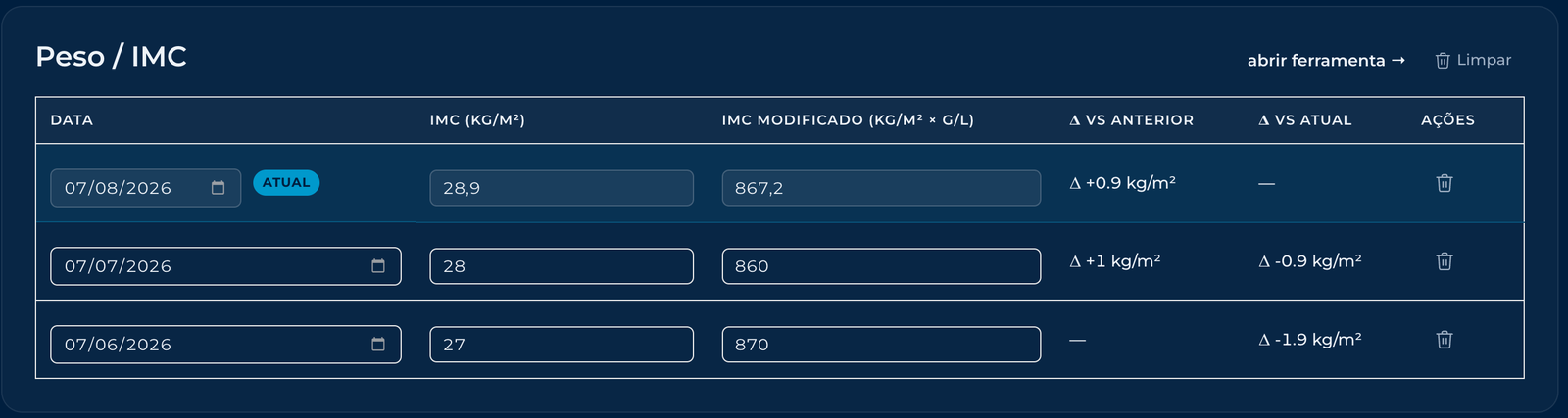
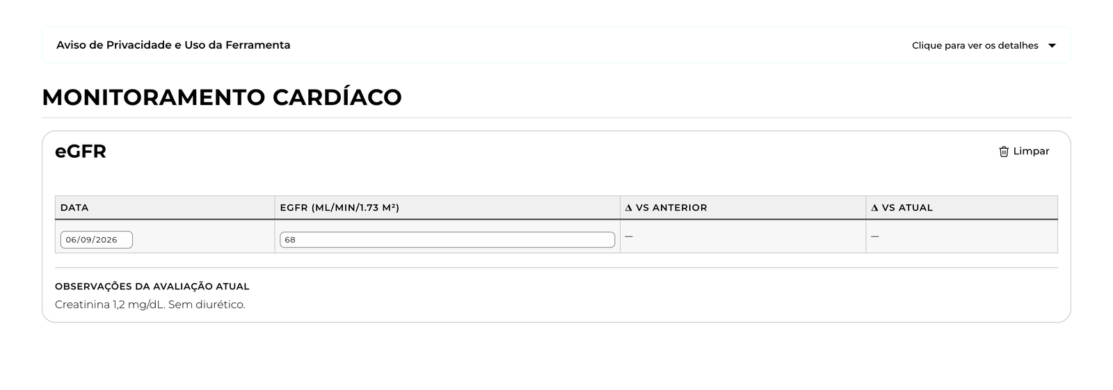
Saying no is half a job. The answers stay in the browser of the health professional who filled them in, so at the next consultation they find the previous application, with the delta already calculated. For anyone who clears the browser or changes computers, there is a path to write the previous result down and compare by hand.
The comparison the doctor asked for is still there, and the answers never leave the browser. Nothing is posted, fetched or persisted server-side. So privacy here is architectural, because no code path sends an answer to the server. What that costs is in Limits.
What shipped
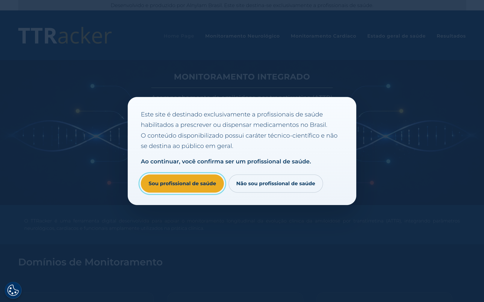
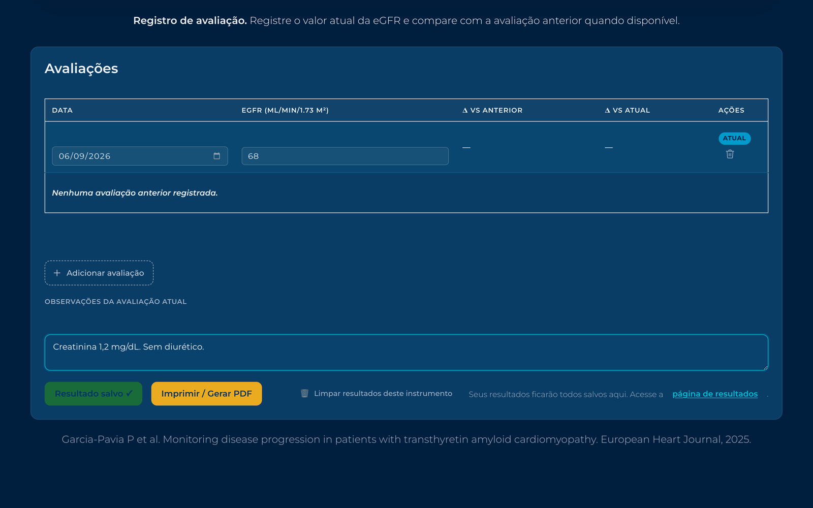
Seventeen validated clinical instruments in Brazilian Portuguese, with calculators, history and comparison. A print layout made for the consultation itself, not for the screen. A self-declared gate for health professionals, as the category requires. Search optimization, because a rare disease platform that nobody finds helps nobody. And accessibility built in rather than checked at the end. The pages ship with 33 automated regression tests, one of them dedicated to it.
 THE GATE
 ONE OF THE 17 INSTRUMENTS
 THE PRINT LAYOUT
How a month was enough
One person, one month, someone else's tooling, inside the client's environment. That only worked because I built the working flow first, with Claude Code and Codex, back when there was no MCP for WordPress and almost nothing ready for it. The skills I wrote for this project are the reason it moved at all. They are the same habit that shows up everywhere else here.
Limits and learning
The platform has usage data and it belongs to the client, so I am not publishing it. The disease is rare, so the audience is small by definition. What shaped everything was the stack. On tooling I had chosen myself, some of these decisions would have been easier, and that is exactly why the case is here.
Local-only has costs of its own, and I would rather name them than pretend local means safe. The answers live in the browser storage of that one computer. Clearing the browser erases them, changing computers leaves them behind, and a shared browser is a shared record. The manual comparison path is the mitigation designed for that, and the rest is the declared price of not holding the data.